Framer tips for beginners
Framer rewards you fast, but only if you know where to focus first. These 20 tips cover the canvas, layouts, components, CMS, and going live, everything a beginner needs to build with confidence.
16
minutes read
Everyone Starts Somewhere. Here's How to Start Smart.
Framer has become the favourite design tool for a reason: it's fast, it's visual, and you can go from idea to live website without writing a single line of code. But like any powerful tool, there's a learning curve. Not because it's hard, but because there's a lot to discover.
The canvas, the component system, the CMS, the animations, they're all intuitive once you've spent time with them. The challenge is knowing where to focus first so you're not spending hours on things that don't matter yet.
I've spent years building in Framer, enough to remember what those early sessions felt like, when everything was new and every click felt like a small win. These 20 tips are the things I wish someone had laid out clearly when I was starting. Some are practical shortcuts. Some are mindset shifts. All of them will make your first Framer projects better and faster.
Getting Started
1. Start with a template, not a blank canvas
This is the single most important tip for beginners: don't start from scratch. A blank canvas is the slowest way to learn Framer because you're solving design problems and learning the tool at the same time.
A good template gives you a working structure to explore, reverse-engineer, and customise. You'll learn how layers are organised, how components work, how CMS collections are set up, all by seeing it already done. Once you understand how a template is built, starting from scratch becomes a real option. Not before.
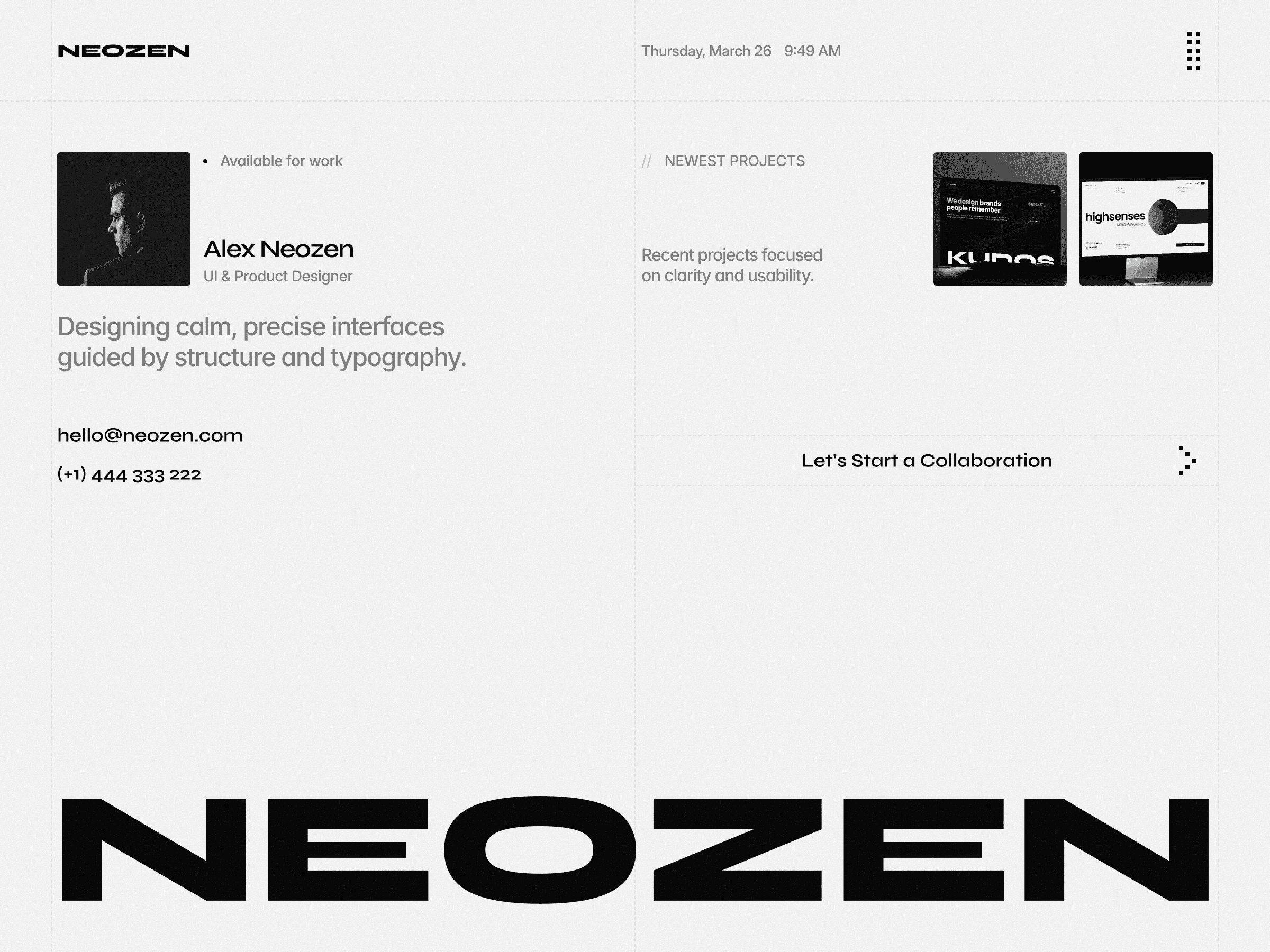
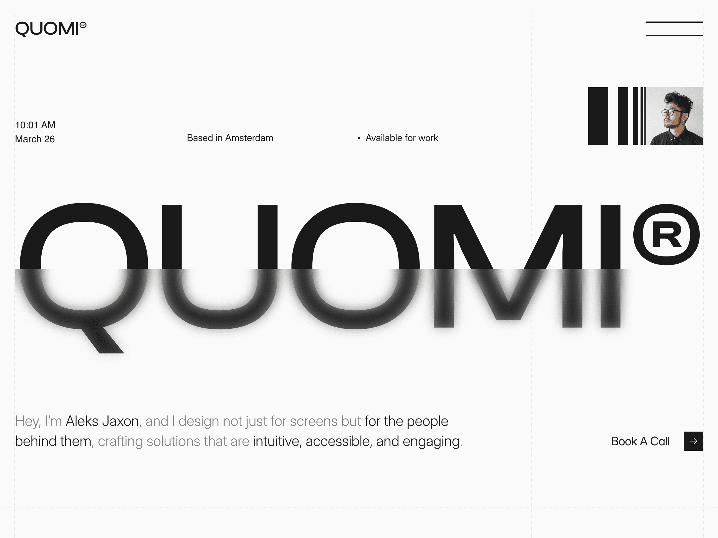
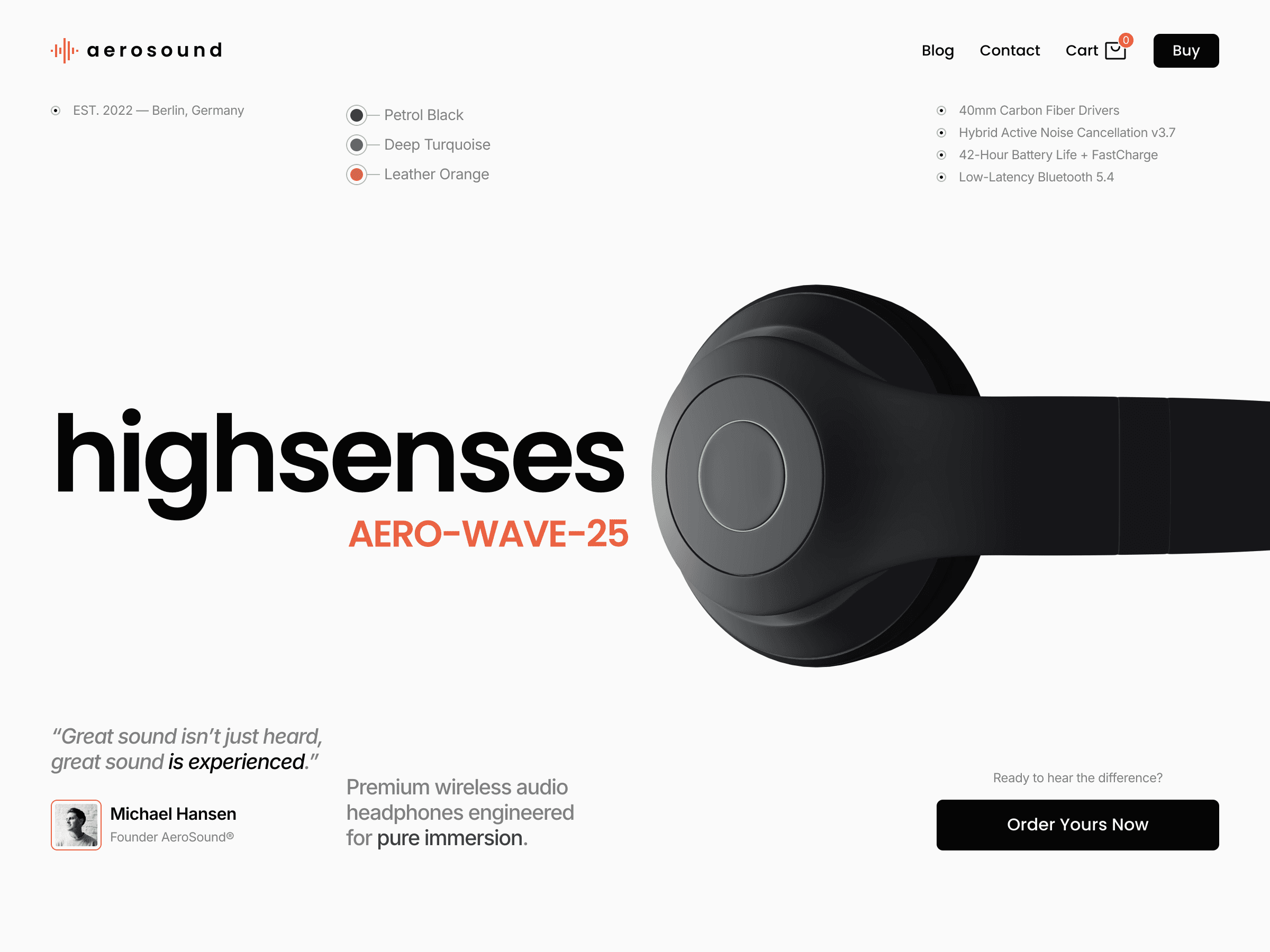
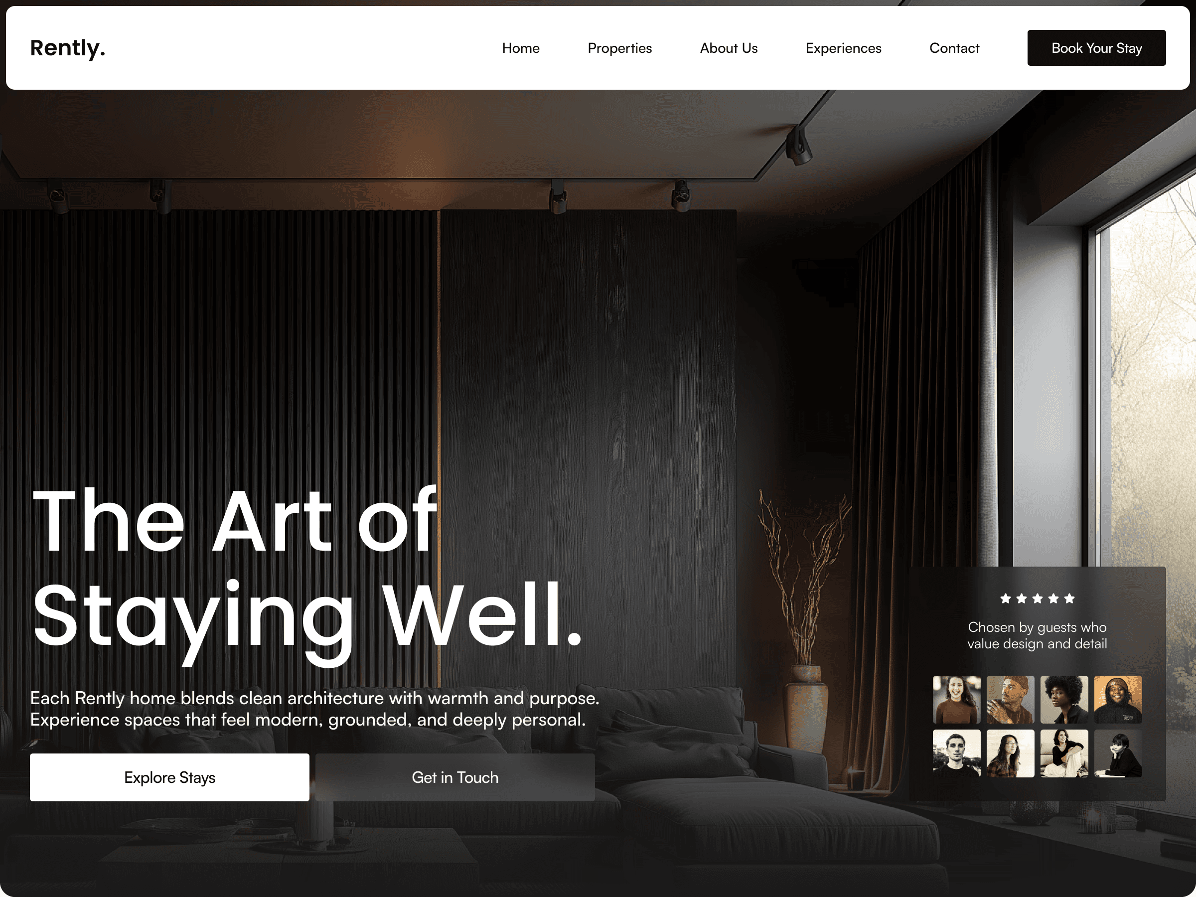
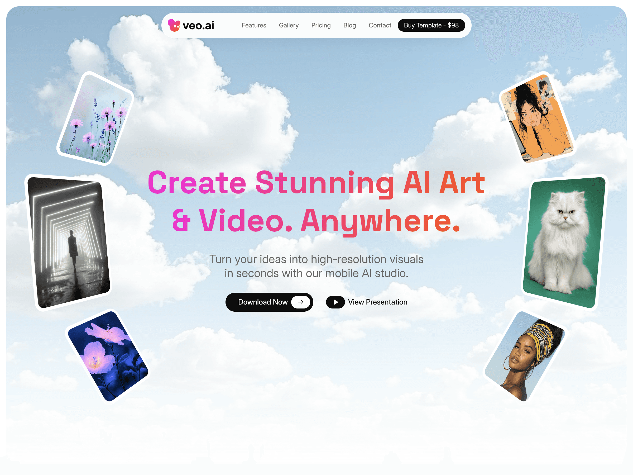
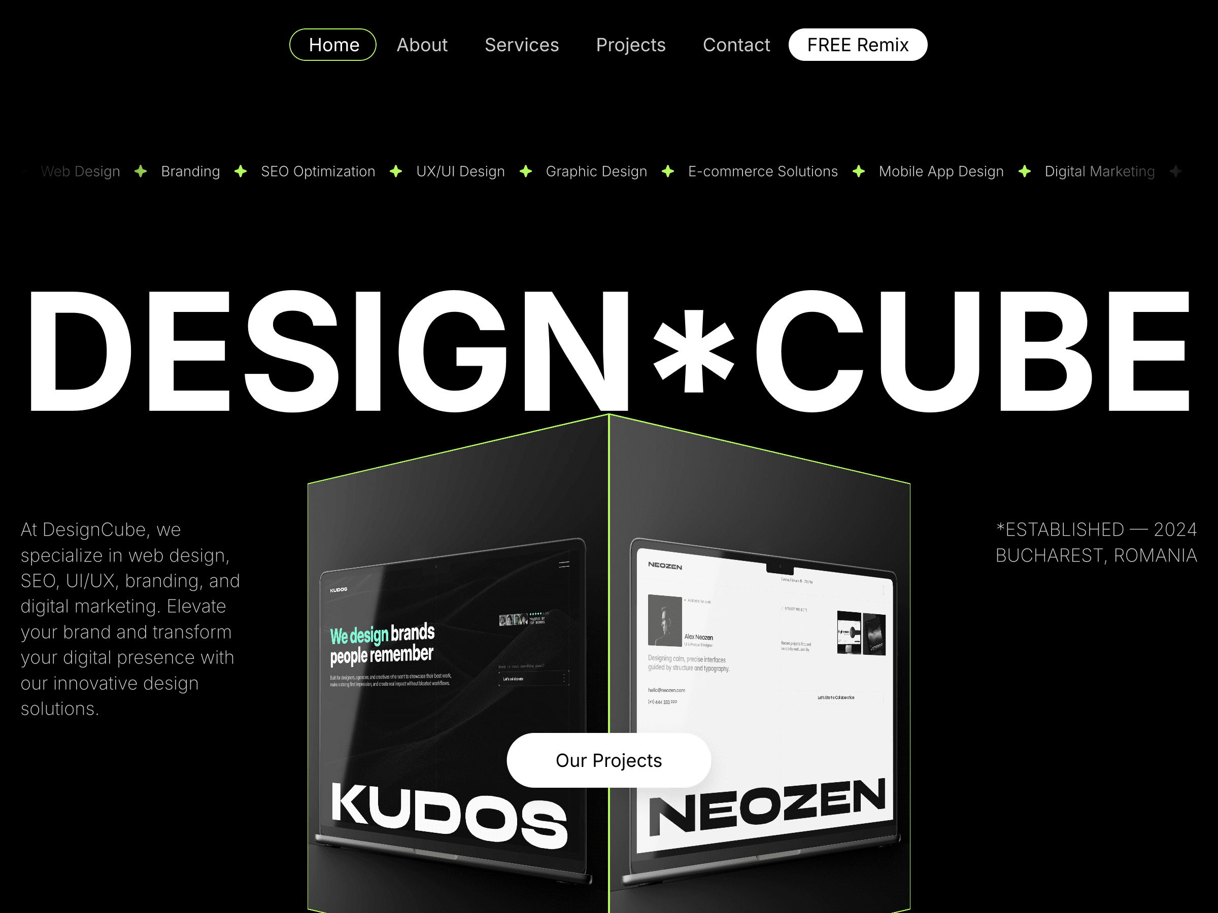
Browse the Framer marketplace and pick a template that matches what you want to build. Duplicate it, take it apart, and rebuild it as your own. That's the fastest education Framer has to offer. Here are some examples of free templates you can start with: Neozen, Quomi, Avenzor, Payble, Agentic, Teamwave, Roco, Kombo
2. Learn the canvas shortcuts early
Framer's canvas is where you'll spend most of your time, and knowing the keyboard shortcuts makes it feel like a completely different tool. The ones worth learning first:
Space + drag — pan the canvas
Cmd/Ctrl + scroll — zoom in and out
F — create a frame
T — create a text layer
R — create a rectangle
Cmd/Ctrl + D — duplicate a layer
Ten minutes with these shortcuts will save you hours of hunting through menus.
3. Understand frames vs stacks vs grids before anything else
Framer has three main layout containers and mixing them up is the most common beginner mistake. Here's the quick version:
Frames are free-form containers. You position children manually with X/Y coordinates. Good for fixed layouts where you need precise control.
Stacks automatically arrange children vertically or horizontally with consistent spacing. Think of them as flexbox. Good for navbars, button groups, card rows, anything that needs to reflow.
Grids arrange children in rows and columns automatically. Good for portfolios, image galleries, and any repeating content layout.
Most modern Framer layouts combine all three. A page might be a Frame containing a Stack navbar, with a Grid section for project cards. Once you recognise how these nest together, layouts start making sense visually.
4. Use the layers panel constantly
New Framer users tend to click directly on the canvas to select and edit elements. Experienced users use the layers panel. The difference in speed and precision is significant.
The layers panel on the left shows you exactly how every element on the page is nested, which is a Frame, which is a Stack, which is a component. Clicking something in the layers panel selects it precisely without accidentally clicking the wrong nested element. Double-clicking a layer name lets you rename it, which makes complex pages navigable.
Get into the habit of naming your layers from day one. "Frame 327" tells you nothing. "Hero Section", "Card Grid", "Nav Bar", these tell you everything.
5. Zoom in before you edit text
Framer's text editing is precise but it's easy to accidentally move or resize a text element instead of editing its content when you're zoomed out. The workflow that prevents frustration: press Cmd/Ctrl + + to zoom to a comfortable level, then double-click the text to enter edit mode. When you're done, press Escape twice, once to exit text edit mode, once to deselect the layer.
Design & Layout
6. Set up your color and font tokens before you start designing
In Framer, color and font tokens live in the right panel under Styles. Setting these up before you start designing means that when you change a brand color, it cascades across every element that uses it, instantly. Without tokens, changing a color means hunting down every layer that uses it manually.
For a typical site, you need: primary color, secondary color, background, text primary, text secondary, and maybe an accent. That's it. Add them before you place your first element and you'll never have to do a find-and-replace on hex codes.
7. Use the right sizing mode for text containers
One of the most frustrating beginner experiences in Framer is text that gets cut off or doesn't wrap properly. Nine times out of ten, this is a sizing issue.
When you select a text layer, look at the W (width) and H (height) fields in the right panel, next to each you'll see a sizing mode dropdown. These are easy to miss at first but critical to understand:
Fixed — the container has a fixed width or height you set manually. If your text grows longer than the box, it gets clipped and disappears. This is the default and the cause of most text overflow problems.
Relative — the size is set as a percentage of the parent container. Useful for responsive layouts where you want an element to scale proportionally with its parent.
Fill — the container stretches to fill all available space in its parent. Useful inside stacks when you want an element to take up the remaining width or height automatically.
Fit Content — the container shrinks or grows to wrap exactly around its content. This is what you want for most text layers, the width can be fixed or fill, but setting the height to Fit Content means the text box always grows to show everything inside it.
For most use cases, hero headlines, body copy, card descriptions, set your width to Fill or a Fixed value that matches your column width, and set your height to Fit Content. Your text will always be fully visible and reflow correctly regardless of length, which becomes especially important when pulling text from CMS fields where content length varies per item.
8. Learn how padding works in stacks
When you select a Stack, the right panel shows a padding field. This controls the space between the stack's edge and its children. A very common beginner mistake is adding spacing by manually pushing child elements around. That breaks as soon as the layout reflows.
The right approach: set padding on the parent Stack, and set the gap between children using the Gap field directly below. Those two controls handle 90% of spacing situations. Manual nudging is almost never the right answer in a stack-based layout.
9. Copy styles between elements
When you have an element styled the way you want and need another element to match it, don't set the properties again from scratch. Right-click the styled element → Copy → right-click the target element → Paste Style. This copies all the visual properties (color, border, radius, shadow, typography) without copying the content or position.
This also works across pages, which is particularly useful for matching components that appear on multiple pages.
10. Use Framer's built-in preview constantly
The Framer canvas preview (the play button at the top right, or Cmd/Ctrl + P) shows you exactly how your site will behave in a browser, with real scrolling, real hover states, and real animations. Don't wait until you publish to check how something looks and feels.
A workflow that saves a lot of iteration: design a section, preview it, adjust, preview again. Treating preview as a regular part of your design loop, not just a final check, means fewer surprises when you go live.
Components & Interactions
11. Understand components before you build a lot of pages
A component in Framer is a reusable element: a button, a card, a navbar, that you define once and use everywhere. When you edit the master component, every instance updates automatically.
The beginner mistake is building the same card or button repeatedly on every page without making it a component. This works fine until you need to change something, then you're updating 40 instances manually.
To create a component: select the element, right-click → Create Component. The original becomes the master. Drag copies from the Assets panel onto your pages. Edit the master to update everything at once.
12. Use variants for interactive states
Components can have variants, different visual states triggered by interactions. A button component might have a Default variant, a Hover variant, and a Pressed variant. Framer handles the transition between them automatically when you connect them to interactions.
To add a variant: select the master component → click the + next to Variants in the right panel → name it (e.g. "Hover") → style it differently → connect the interaction in the prototype tab.
This is how Framer creates hover effects, active states, and toggle animations without writing any code. It takes about 10 minutes to learn the first time and it unlocks a huge amount of interactive design capability.
13. Don't animate everything, animate with purpose
Framer makes animation so easy that it's tempting to add motion to everything. Resist this. Animations that exist purely because they're possible tend to slow down the site and distract from the content.
The animations that earn their place are the ones that guide attention, confirm an interaction, or reveal content in a natural sequence. A fade-in on scroll that reveals a section as the user reaches it, purposeful. A button that wiggles for no reason, not purposeful.
A good rule of thumb: if you can't explain why the animation is there in one sentence, remove it.
14. Use scroll animations with the Smart Components panel
Framer's scroll-driven animations are one of its most powerful features for creating that premium, modern feel that makes sites look handcrafted rather than templated. The good news for beginners: you don't need to understand the full animation system to use them effectively.
Start with Opacity 0 → 1 combined with a Y offset of 20-30px — the element starts 20-30px below its final position and fades in as it enters the viewport. Keep the duration between 0.4-0.6 seconds with an Ease Out curve for the most natural feel.
The best way to learn how it's set up: open any quality Framer template that uses scroll animations, select one of the animated elements, and look at how it's configured in the right panel. Reverse-engineering an existing implementation teaches you far more than reading about it, and you'll immediately see the exact offset, duration, and easing values being used so you can replicate them in your own projects.
Once you're comfortable with the basic fade-in reveal, experiment with staggered animations, where child elements inside a stack animate in sequence with a small delay between each. That's the pattern behind those satisfying card grid reveals you see on agency sites.
CMS & Content
15. Learn the CMS before you need it
The Framer CMS (Content Management System) lets you manage repeating content: blog posts, projects, team members, products, from a structured database rather than duplicating pages manually. It's one of Framer's most powerful features and one that beginners often avoid because it looks complex.
It's not complex once you understand the basic structure:
Collection — a database of similar items (e.g. "Blog Posts")
Fields — the data each item contains (Title, Date, Thumbnail, Content)
Collection Page — a template page that displays each item using its fields
The best way to learn it: pick a template that uses CMS (like Neozen or Quomi), open the CMS panel, look at how the collections are structured, and trace how the fields connect to the elements on the collection pages.
16. Use variables in page titles and meta descriptions
Once you're comfortable with the CMS, this is a small but important SEO detail: in Framer's page settings for a CMS collection page, you can use variables from your collection fields in the page title and meta description. Instead of every blog post having the title "Blog Post — My Site", you can set it to {{Title}} — My Site and each post gets its own unique title automatically.
This applies to every field in your collection: title, excerpt, category, date. Set it up once on the collection page template and every item inherits it. This is how your blog meta descriptions work automatically as soon as you fill in the CMS fields.
17. Keep your CMS fields clean and purposeful
A common beginner mistake when setting up a CMS collection is adding too many fields "just in case." This creates clutter in the CMS editor and makes filling in new entries slower and more confusing.
Start with the minimum fields you genuinely need. For a portfolio: Title, Slug, Thumbnail, Description, Tags, Date. For a blog: Title, Slug, Cover Image, Excerpt, Content, Date, Category. You can always add fields later, removing them is harder if content is already linked.
Going Live
18. Check mobile before you publish, seriously
Framer's responsive design works well but it doesn't always do exactly what you expect, especially with custom component sizing and absolute-positioned elements. Before you publish anything, switch to the mobile breakpoint (390px) and scroll through every page.
The most common mobile issues for beginners: text overflowing its container, images not scaling correctly, and elements that were positioned absolutely on desktop breaking on mobile. All of these are fixable in 5-10 minutes if you catch them before launch. They're embarrassing to discover after.
19. Set your SEO basics before you publish
Three things that take 10 minutes and matter immediately:
Favicon — Site Settings → General → Favicon. Upload a square version of your logo or initials. Without this, browsers show a generic globe icon in the tab.
Social preview image — Site Settings → General → Social Image. This is the image that appears when someone shares your link on Twitter, LinkedIn, or iMessage. Make it 1200×630px with your site name or logo. Without this, social shares show a blank preview.
Page meta descriptions — every page should have a unique description under 160 characters in its Page Settings. These are what Google shows in search results. Write them for humans, not just search engines.
20. Publish to your Framer subdomain first, then connect your domain
When you're ready to go live, don't connect your custom domain immediately. First, publish to your free Framer subdomain (yoursite.framer.website) and check the live site thoroughly, not just in the canvas preview. Real browser rendering occasionally differs from the Framer preview, especially with custom fonts, third-party scripts, and animations.
Once you're happy with the live subdomain version, then connect your custom domain in Site Settings → Domains. This two-step approach means your custom domain always points to a version you've already verified works correctly.
The Most Important Tip of All
Ship before it's perfect. A site that's live and 90% right is infinitely more valuable than a site that's 100% right and still sitting in your workspace.
Framer makes iterating fast. Publish, share, get feedback, improve. The best Framer sites are built in public, not perfected in private.

Cristian Mielu
Founder UIHub.design
Share this page on:
Complete Templates collection
$1,286
$290
Best value
All Cristian Mielu's
12
premium templates.
Every new one included, forever.
Payments powered by
Other useful articles


Better Framer skills are a few reads away →