The Case for Designing With Variety Built In
Most templates let you change the content but not the layout, so sites built from them end up wearing the same skin. I think the fix lives at the component level, in small, deliberate variants that do the heavy lifting. Here’s how that works in Tektura, and where Framer’s Skills fit in.
7
minutes read

How Component Variants Stop Every Site Looking Identical
Quick bit of good news before we get into it: Framer recently shipped Skills, reusable instructions you write once and invoke from the agent chat with a /command. A skill can capture your design system, your brand voice, an SEO checklist, a launch review, basically any repeatable rule you'd otherwise retype in every prompt. Define your /design-system once, and every future page request follows it automatically. It's a small feature with a big unlock: it lets the reasoning behind a design system travel with the project instead of living only in your head.
That's a great lens for what follows, because the same discipline that makes a Skill genuinely useful, writing down why your system works the way it does, not just what it looks like, is exactly what makes a good template variant system so powerful. Here's the fun part.
The opportunity most templates leave on the table
Anyone who's bought a template before knows the feeling: you want it to feel like yours, not like a recognizable skin someone else is also wearing. Most templates give you one fixed layout per section, so you get to swap the logo, change the copy, drop in your own photos, and that's genuinely great for getting live fast. But there's a bigger opportunity sitting right there: what if the layout itself could flex too, not just the content?
That's exactly the kind of problem worth solving at the component level, and it turns out to be very solvable.
The fix: sections as components, each with real variants
On Tektura, every section is built as its own component, and every component ships with multiple variants, several at the Desktop breakpoint alone. The result: the same content can lay out in a huge number of different ways without rebuilding anything, so two sites built from Tektura get to actually look like two different sites.
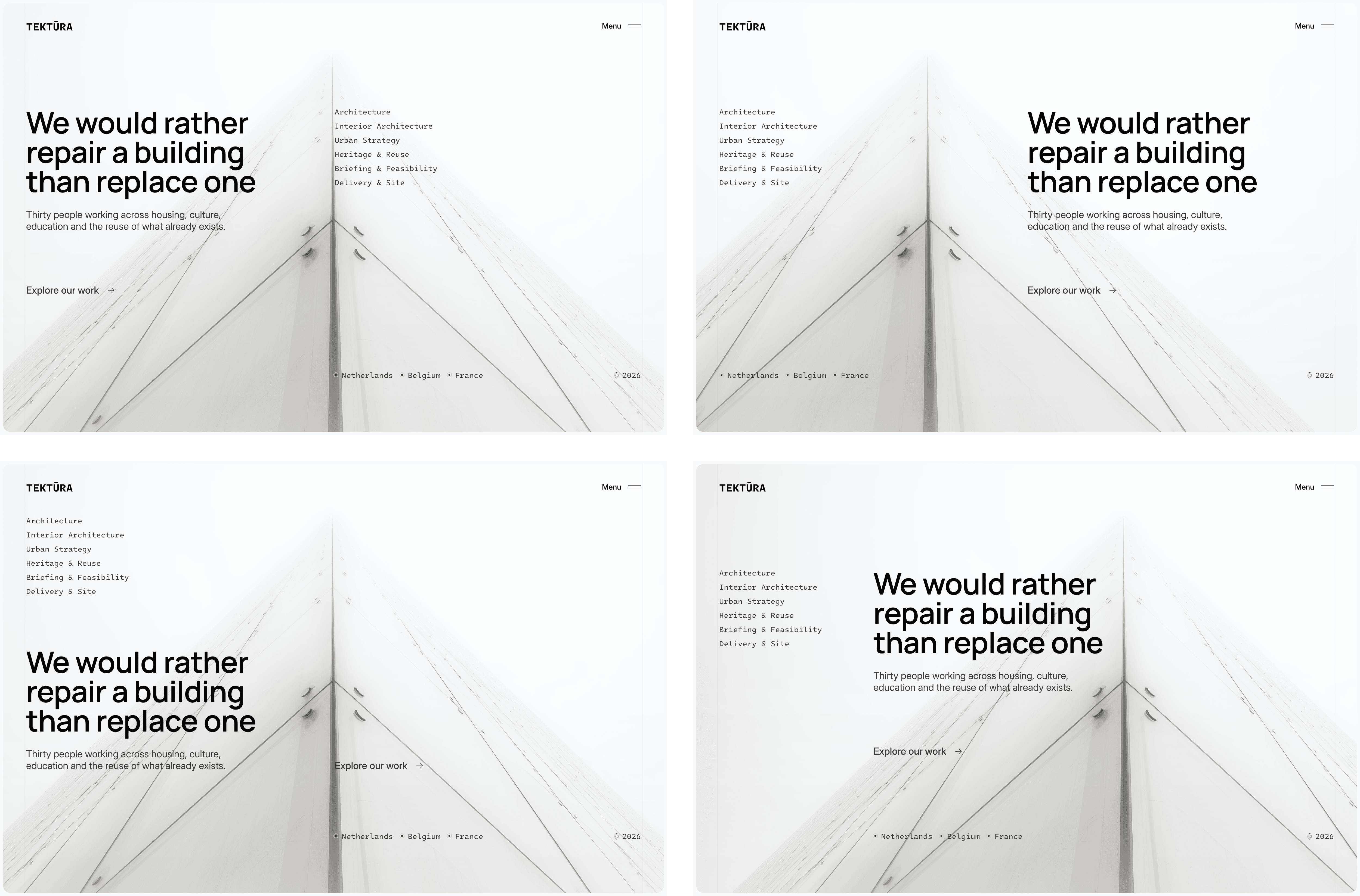
Here's what that looks like in practice, pulled straight from the design system:
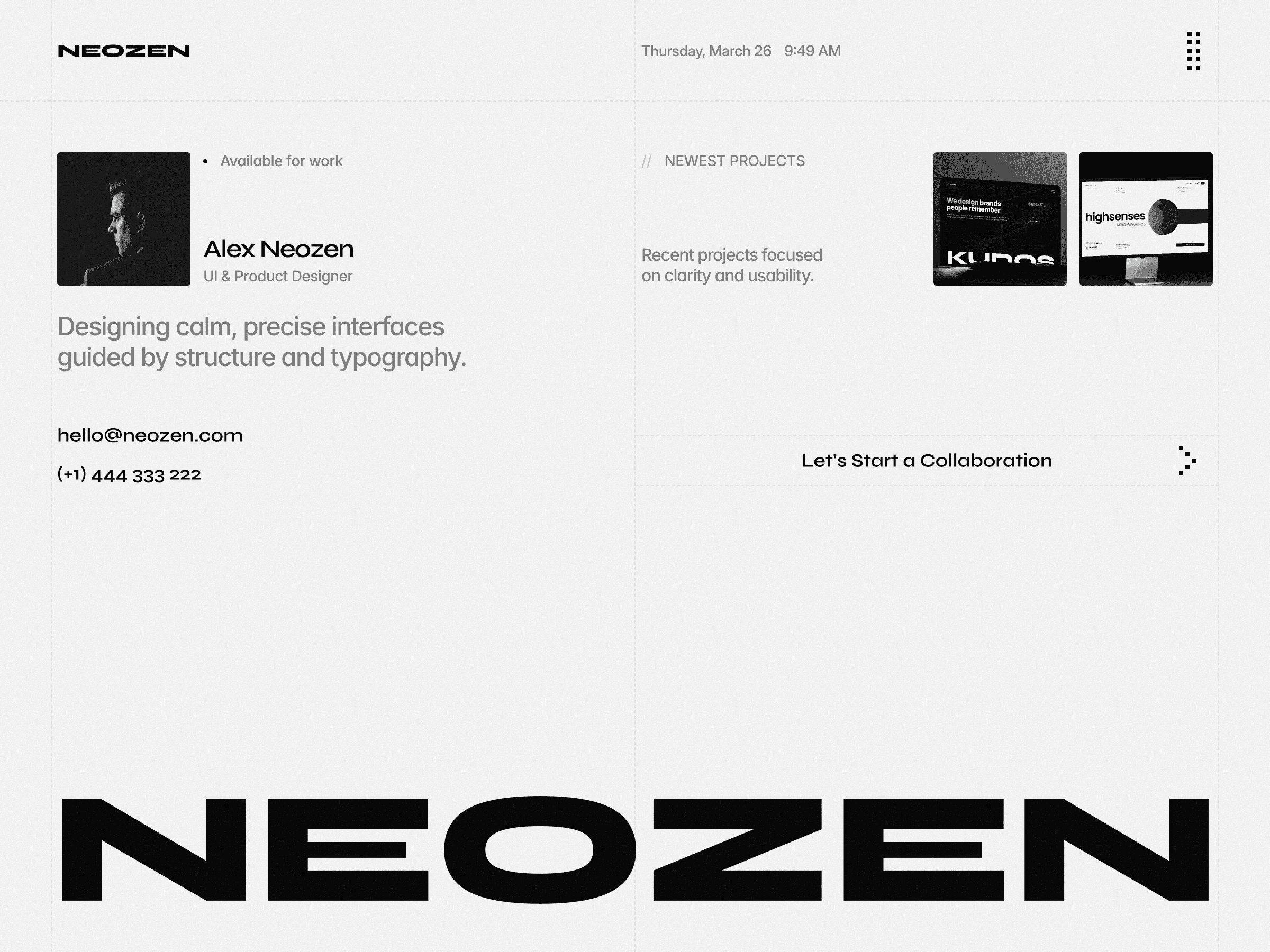
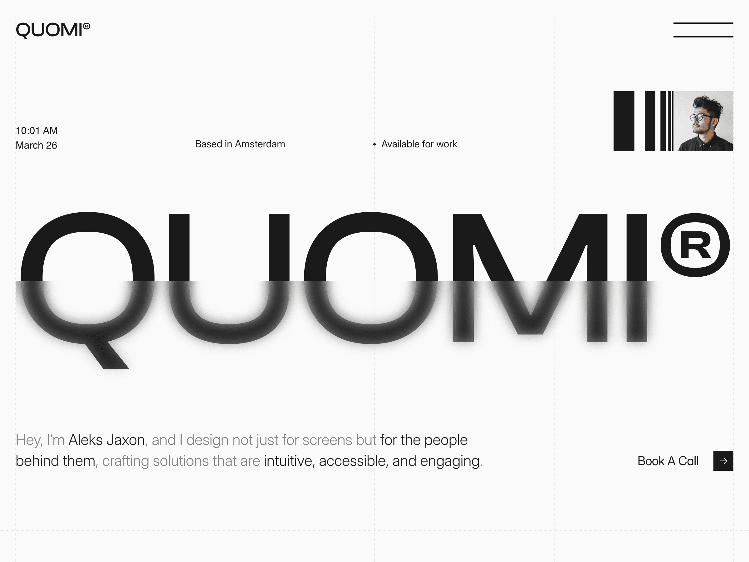
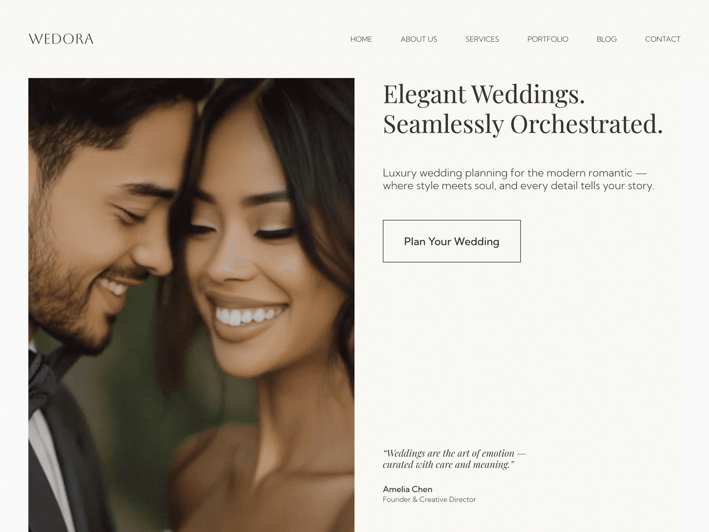
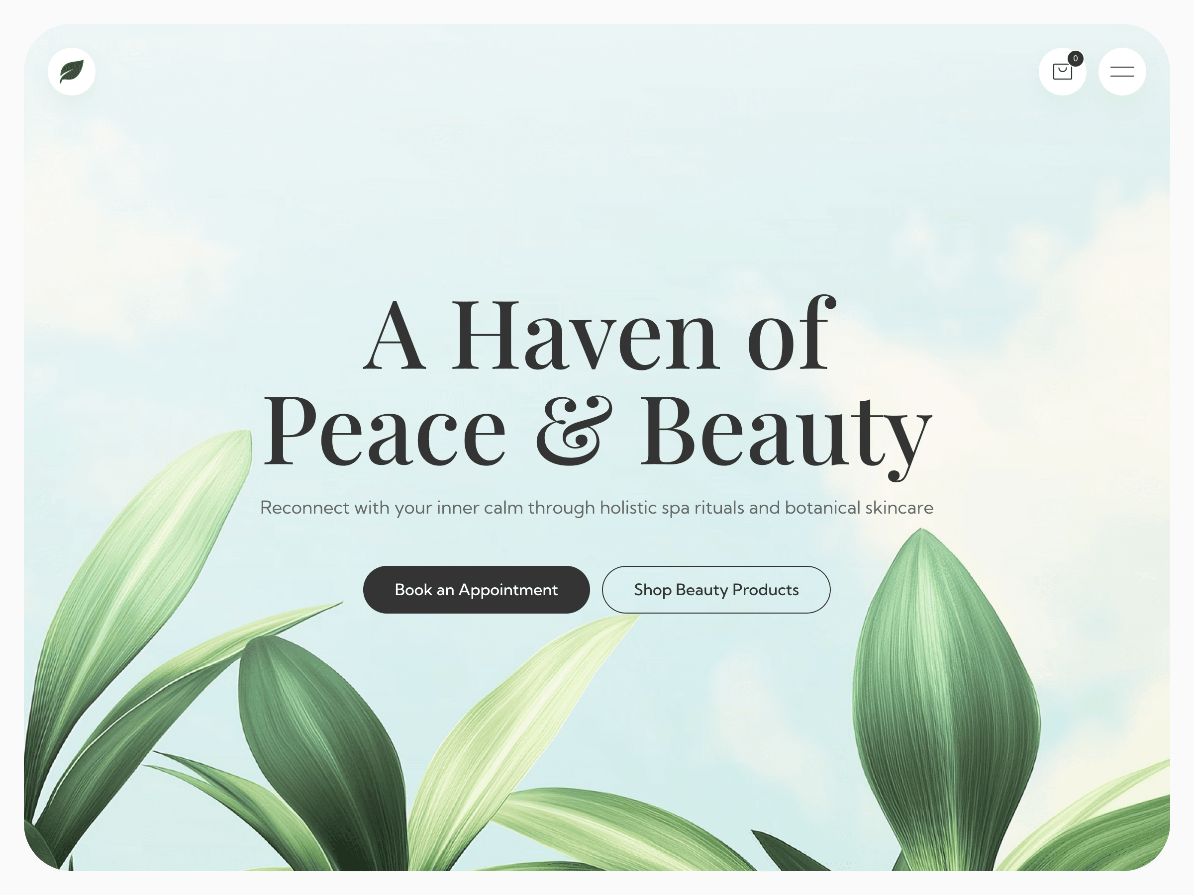
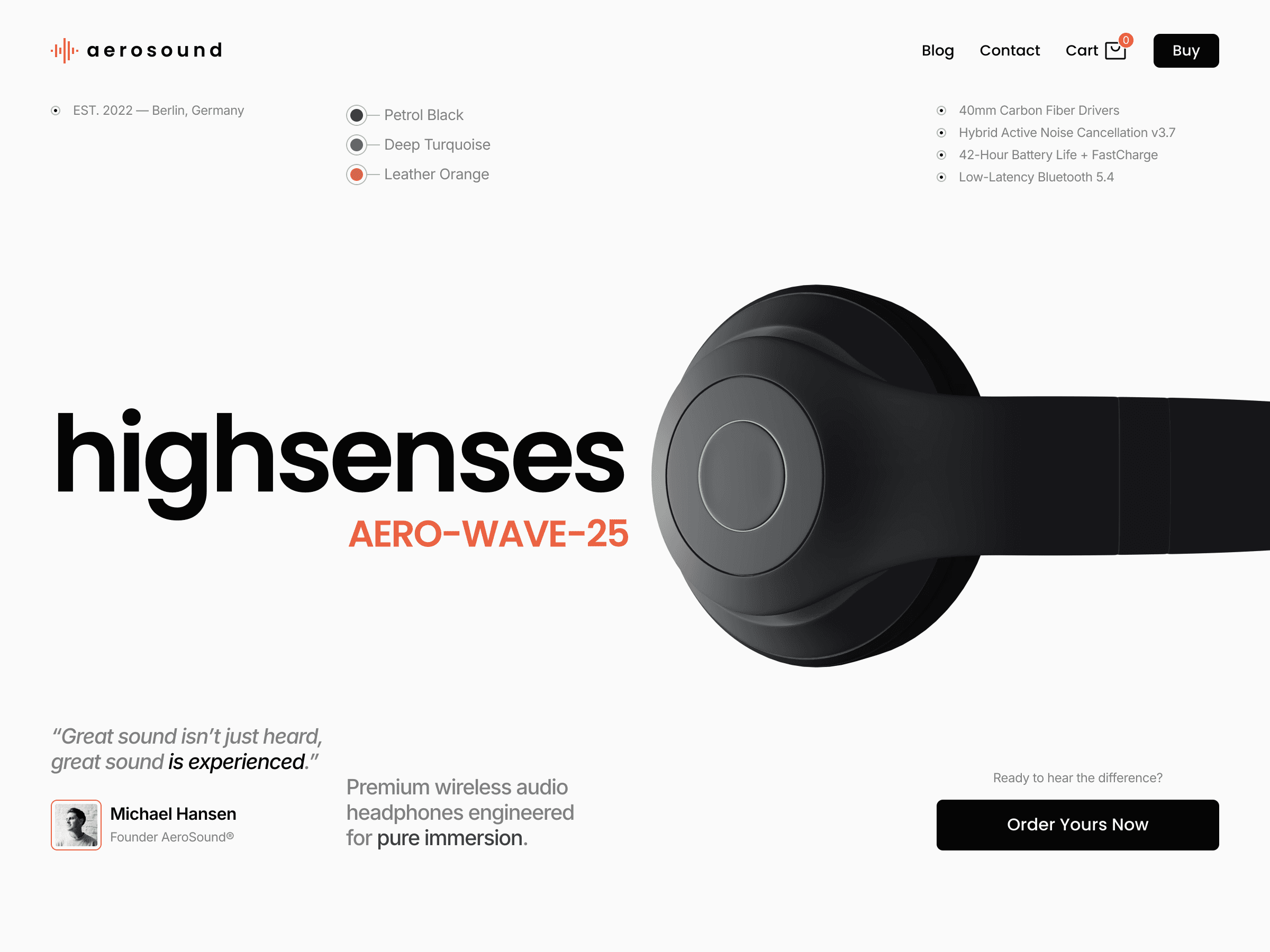
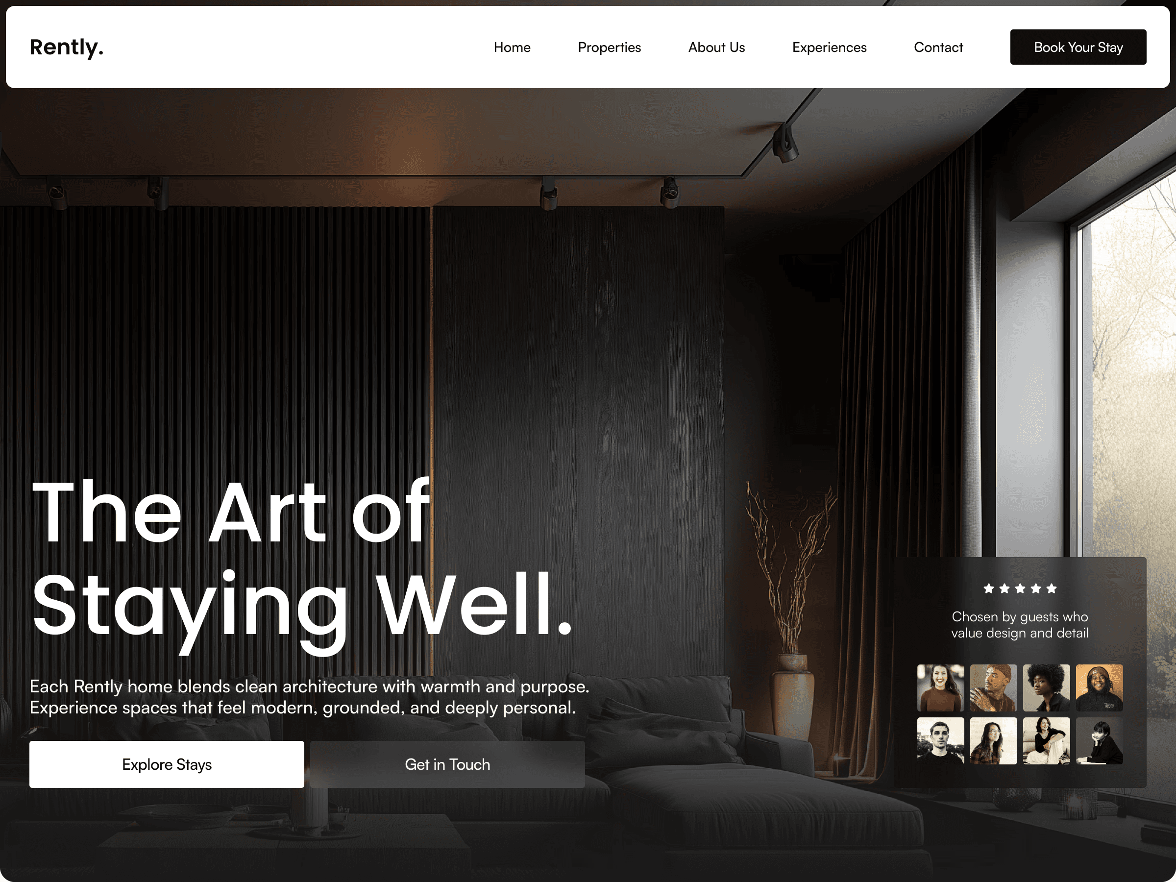
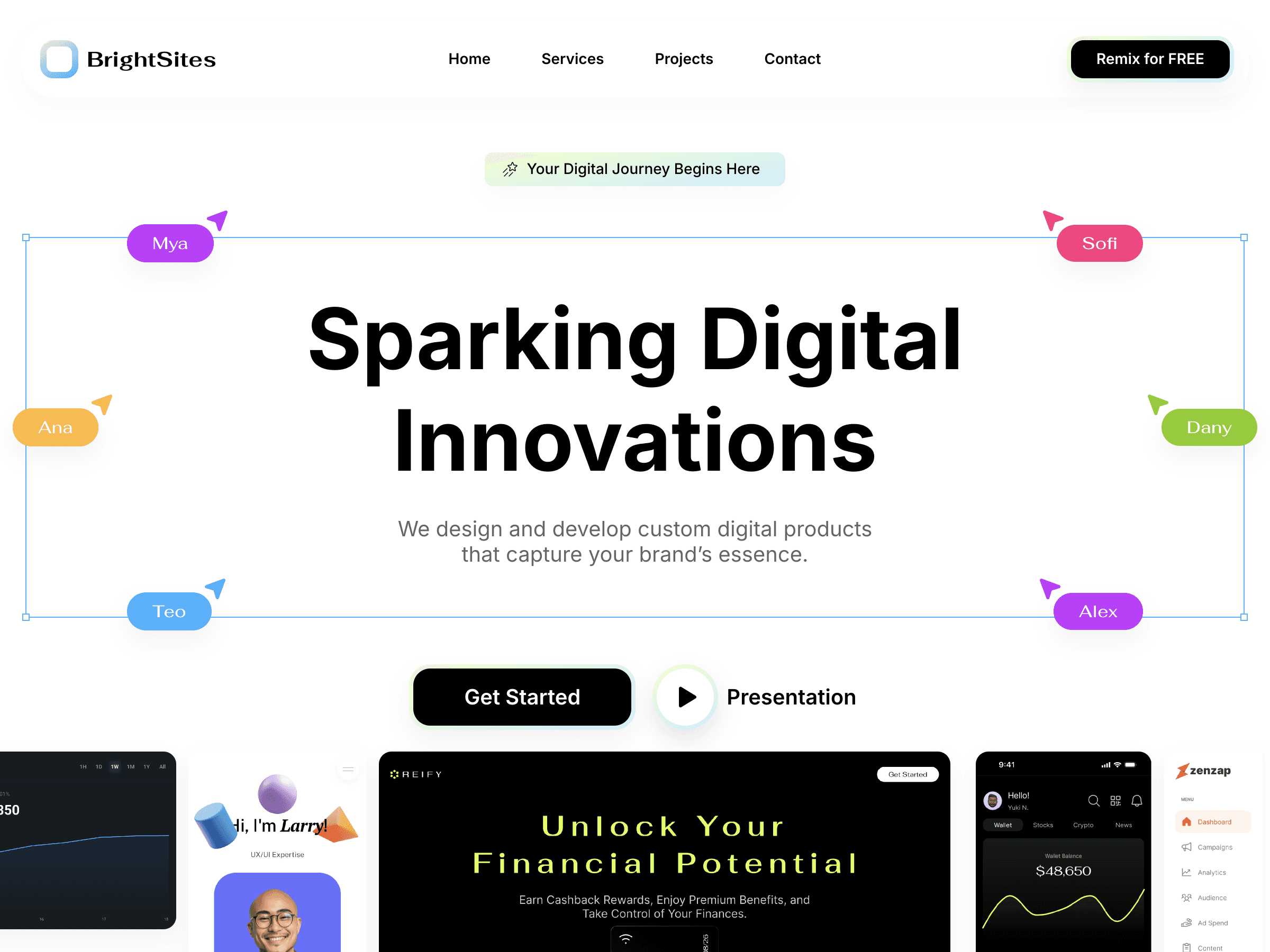
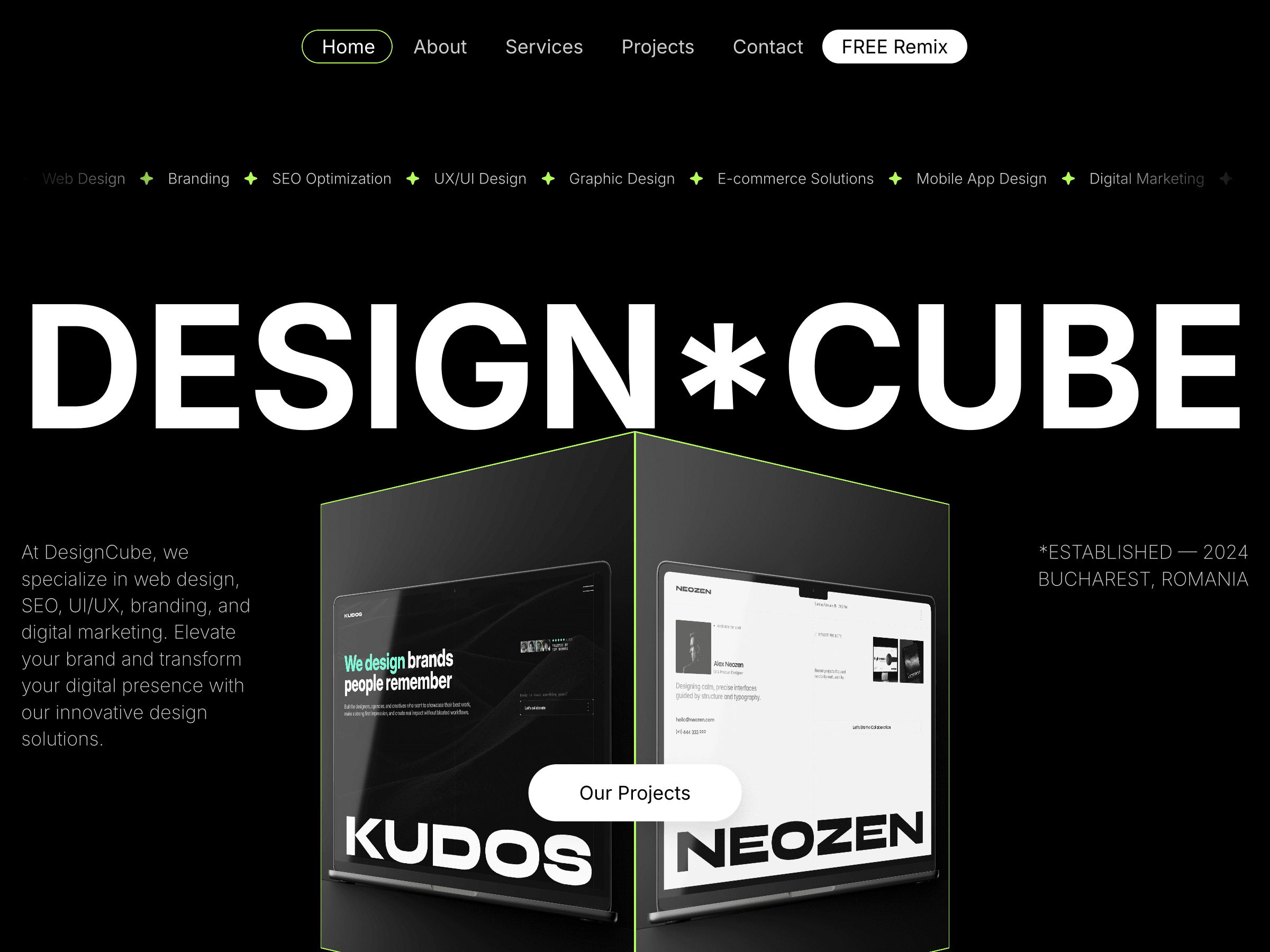
The hero component ships four Desktop variants. At a glance they look closely related, same building photograph, same heading, same supporting text block, and that's by design. Look closer and what's actually changing is precise: which side carries the heading, how far down the vertical axis it sits, whether the metadata list appears before or after the headline in reading order. Nothing dramatic. Everything deliberate.
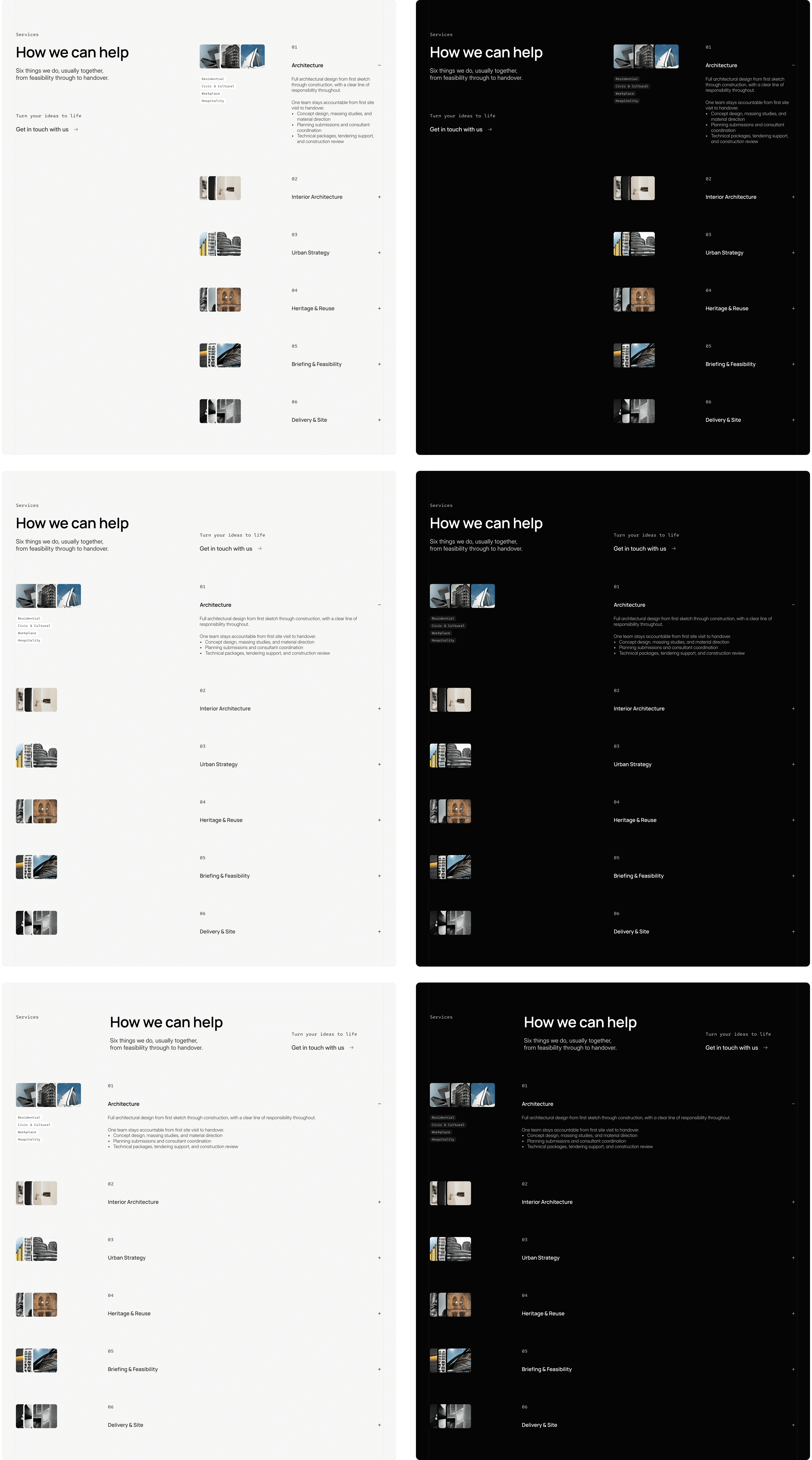
The Services section component tells the same story from a different angle. It ships six variants split evenly across light and dark themes, three of each. Here the layout is busier, a heading, a supporting paragraph, a call to action, and a stacked list of expandable service items with thumbnail pairs, so there's more surface area for small shifts to matter. Across the six versions, what moves is where the heading sits relative to that list (tucked into a narrower left column versus given more breathing room at the top), how wide the heading itself runs, and where the supporting text and CTA land in the reading path. The list of services underneath, and its thumbnails, stays structurally identical in every version. Again, nothing about the underlying grid changes, and the light/dark pairing means the exact same layout logic gets applied twice, once for each theme, rather than treating dark mode as an afterthought.
This is the detail that makes the whole system click, and it's easy to miss if you're expecting variants to mean dramatic layout swings. They don't need to. A hero that flips from "image-dominant, text overlay" to "50/50 split with a sidebar" is one kind of variant system. A hero that shifts heading position and content-side by a few hundred pixels, four times over, is a different and honestly more elegant one. The first kind changes what a section is. The second kind changes how a section feels next to its neighbors, which is the more interesting problem, and the more rewarding one to solve well.
Why the small differences do the heavy lifting
Because Tektura's variants are subtle and controlled, changing content-side and heading position rather than density or structure, a buyer gets to pick freely with total confidence. Every combination stays on-grid, on-brand, and legible. There's no wrong choice, which is the whole point: the real craft in building a system like this isn't offering more options, it's designing the kind of options where every pick works.
That same constraint quietly does another job: it protects rhythm across the page. If a buyer happens to pick the hero as text-left, then services as text-left, then testimonials as text-left too, the page could start to feel repetitive, even though each section looks great on its own. The nice part is nobody has to think about that while building. The variant set was shaped so that picking any handful of them tends to produce good variation by default, because that thinking was already done once, upfront, by the person who built the components.
Why this beats rebuilding by hand
The alternative to a variant system is the old way: want a different layout, rebuild the section yourself, or bring someone in who can. Variants replace that with something faster and friendlier:
Instant. No rebuilding, no new layer structure, just a dropdown in the right panel.
Safe. Every variant lives inside the same grid and type system, so nothing breaks no matter which one gets picked.
Already resolved. The rhythm question above, avoiding four sections that all read the same beat, was solved ahead of time by the person who built the variants, not left as homework for the buyer.
That's the real gift here. A buyer isn't just getting more layout options, they're getting the design judgment baked in, ready to use, without having to develop that judgment themselves.
Where Skills come back in
This is where Framer's Skills feature gets genuinely exciting for what's next. A /design-system skill can tell an agent which components, styles, spacing, and layouts to use when it builds a page, but it turns out variant selection deserves a skill of its own. Colors, type, and spacing are stable rules that barely change once set. Which variant to use, and on which breakpoint, is a different kind of knowledge entirely: it's specific to each component, it grows as new sections and versions get added, and it needs its own naming discipline to stay reliable. Folding all of that into one design-system skill would bloat the file that's supposed to stay about brand consistency.
So the natural next step is two skills working together: /design-system for the look, and a second skill, /sections-variants, dedicated entirely to variant selection. Its job is simple to state and genuinely useful in practice: always insert a real Sections component rather than building a layout by hand, set the variant on the Desktop breakpoint, then match it with the corresponding Tablet and Phone variant of that same component, so a page reads as one consistent design at every screen size. It also holds the map itself, which components exist, which variant names belong to each one, and which version numbers line up across breakpoints, so the agent is choosing from an exact, current list rather than guessing at a name that might not exist.
Prompt both skills together, /design-system and /sections-variants, and an agent building a new page now has everything it needs: what the page should look like, and exactly which real variant of each section to reach for, at every breakpoint, without inventing anything that isn't already in the project. That's not limited to reusing pages that already exist, either. The same pairing is just as useful when the request is a brand-new page for a use case the project has never had before, a landing page for a different service line, a page built around a new campaign, a section arrangement no one has tried yet. The agent still isn't inventing layouts from scratch: it's assembling a new combination from real, existing variants, guided by the same rhythm and consistency logic that shaped the system in the first place.
The everyday workflow doesn't need an agent at all, and that's exactly the strength of it: most buyers will keep clicking through the right panel by hand, fast and confident, no prompting required. But as more page-building work shifts toward agents, canvas-native or external, having that reasoning written down as two clear, focused skills means that shift only makes things better. The hard, thoughtful part was already done when the components were designed. The skills just mean that thinking keeps paying off, well into whatever comes next.
If you want to see this thinking applied end to end, Tektura is where it lives: every section built as a component, every component carrying its own set of quietly different variants, ready for you to pick, mix, and make your own.

Cristian Mielu
Founder UIHub.design
Share this page on:
Complete Templates collection
$1,286
$290
Best value
All Cristian Mielu's
12
premium templates.
Every new one included, forever.
Payments powered by
Other useful articles


Better Framer skills are a few reads away →